New Colors, New Aesthetics, New Design Landscape from DuPont Surfaces
New Colors, New
Aesthetics, New Design Landscape from DuPont Surfaces
How the latest colors
from DuPont™ Surfaces are changing the commercial and residential design
landscape.
Call me a Corian® guy, and I won’t deny it. Corian® is one of the most fantastic raw
materials available to the building supply market. But beyond a raw material, the last few years
have seen a resurgence of incredibly innovative and inspirational colors from
the DuPont Surfaces team - being capped off this year with the launch of new, unmatched,
patented aesthetics for both Corian® solid surfaces and Zodiaq® quartz surfaces.
I have spent my 25+ year tenure as a CKD traveling the globe
to seek out the latest design trends and bring them to the North American
design community. The bulk of my
best-received, “ah-ha!” ideas tend to come from Europe. Whether it’s moving countertops, ornate furnishings,
or entirely new building materials, Europeans seem to have a looking glass into
the future of design. This year’s new
colors of Corian® and Zodiaq® have that European flare that fills a gap in certain
design aesthetics that were missing from the North American (and global) surfaces
market.
My take on how these colors hit the mark:
Reason 1:
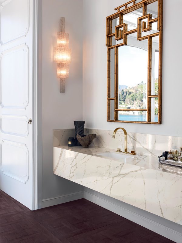
Veining. Movement. Intricate patterns.
The new Prima Collection of Corian® colors offer patented, never-before-seen
aesthetics that many probably thought were not possible with solid surface
materials. The pronounced veining offers
the dramatic appeal of marble all the while maintaining the benefits of being a
workable, renewable material.
 |
| Corian® Limestone Prima Tabletops |
 |
| Corian® Smoke Drift Prima Countertops |
Reason 2: Urban
inspiration.
 |
| Corian® Carbon Concrete |
The Concrete Collection of Corian® colors provides a raw,
neutral palette while still capturing touches of movement, texture and visual
intrigue.
Reason 3: “White hot”
colors and a nuanced neutrals.
What more can I say?
Neutrals will always win for those who want a one-and-done approach to
selecting their countertop color.
Neutral colors do not fade in and out of color trends; they are a permanent
fixture and always have a place in the residential and commercial surfaces
market.
 |
| Backlit Corian® Gray Onyx |
Reason 4: Playing
with light.
The 1/2" thickness of Corian® allows for unique back-lighting options that are not possible with other opaque surfacing
materials. The new Onyx Collection not
only hits the mark with all previously mentioned attributes, but offers an
incredible depth with its swirling patterns and varying levels of opacity. In my opinion, these colors are a huge win
for the commercial segment.
Reason 5: Pick no
bone with stone.
Quartz surfaces are sky-rocketing in popularity, especially in the residential market. Homeowners seem to be
veering away from the robotic-granite-buying experience – all the while
maintaining a strong appreciation for stone surfaces. While perhaps nothing can capture the unique
colors and patterns that come with a natural stone surface, the quartz color
palette is evolving at a rapid pace, offering more and more unique,
natural-stone-like aesthetics. The
entire Pietra Collection of Zodiaq® colors – six of which are new for 2017 –
provide a fantastic variety of options that take these aesthetics to the next
level with unique veining and patterns.
 |
| Zodiaq® Valente Pearl |


Comments
Post a Comment